About
Staples is a well-known American office retail company that specializes in providing office supplies, business services, and solutions to businesses and consumers. Founded in 1986 by Leo Kahn and Thomas G. Stemberg, Staples has grown to become one of the largest office supply retail chains globally.
The original design with all caps and the curve in L is an excellent and simple design that conveys the meaning effectively. It was lacking a logo mark like target, but the actual logo itself was fantastic. The redesign was with titlecase was great and it gave a logo mark. I wanted to redesign the new logo and give a different logo mark and a different typeface & color.
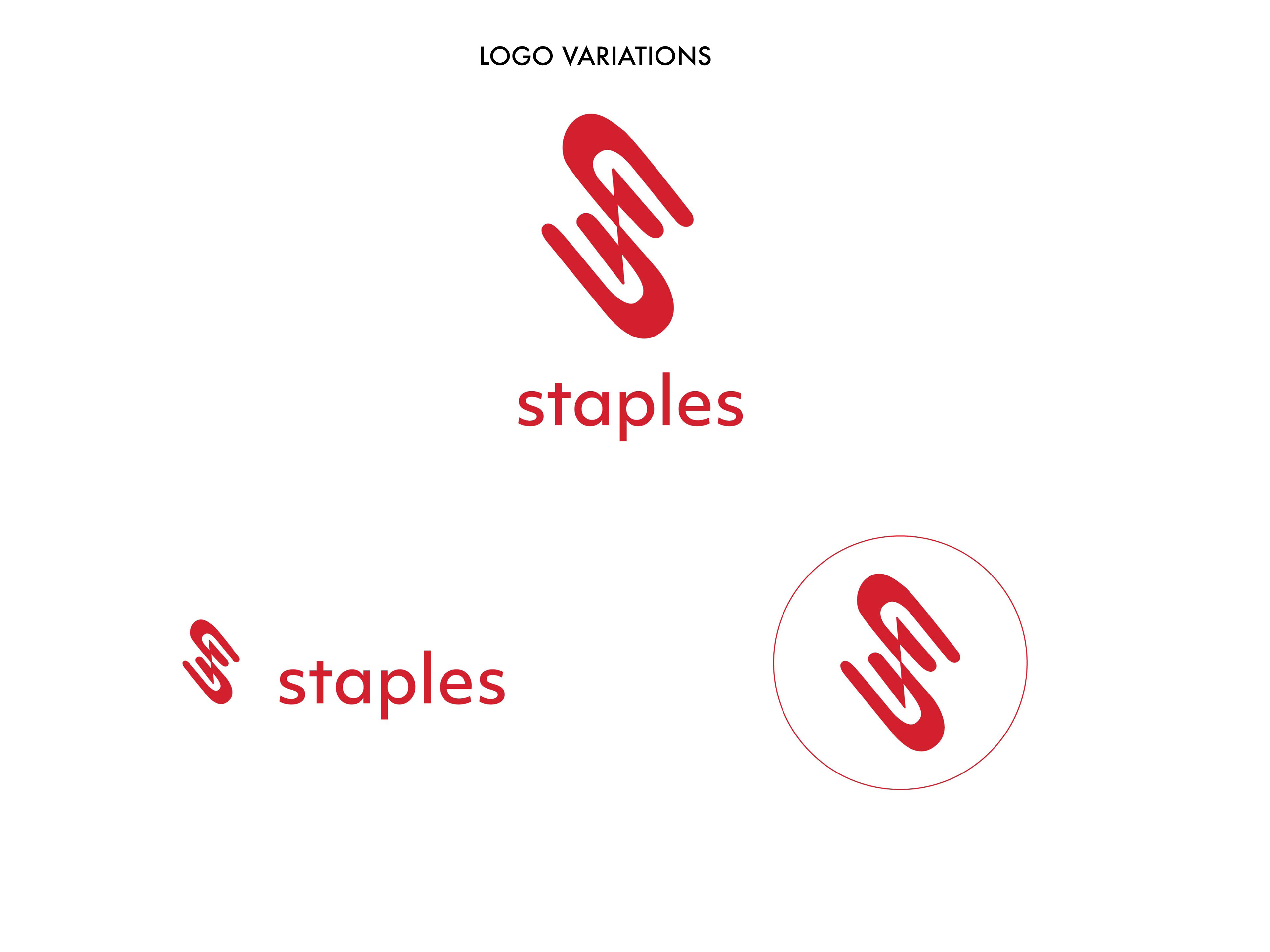
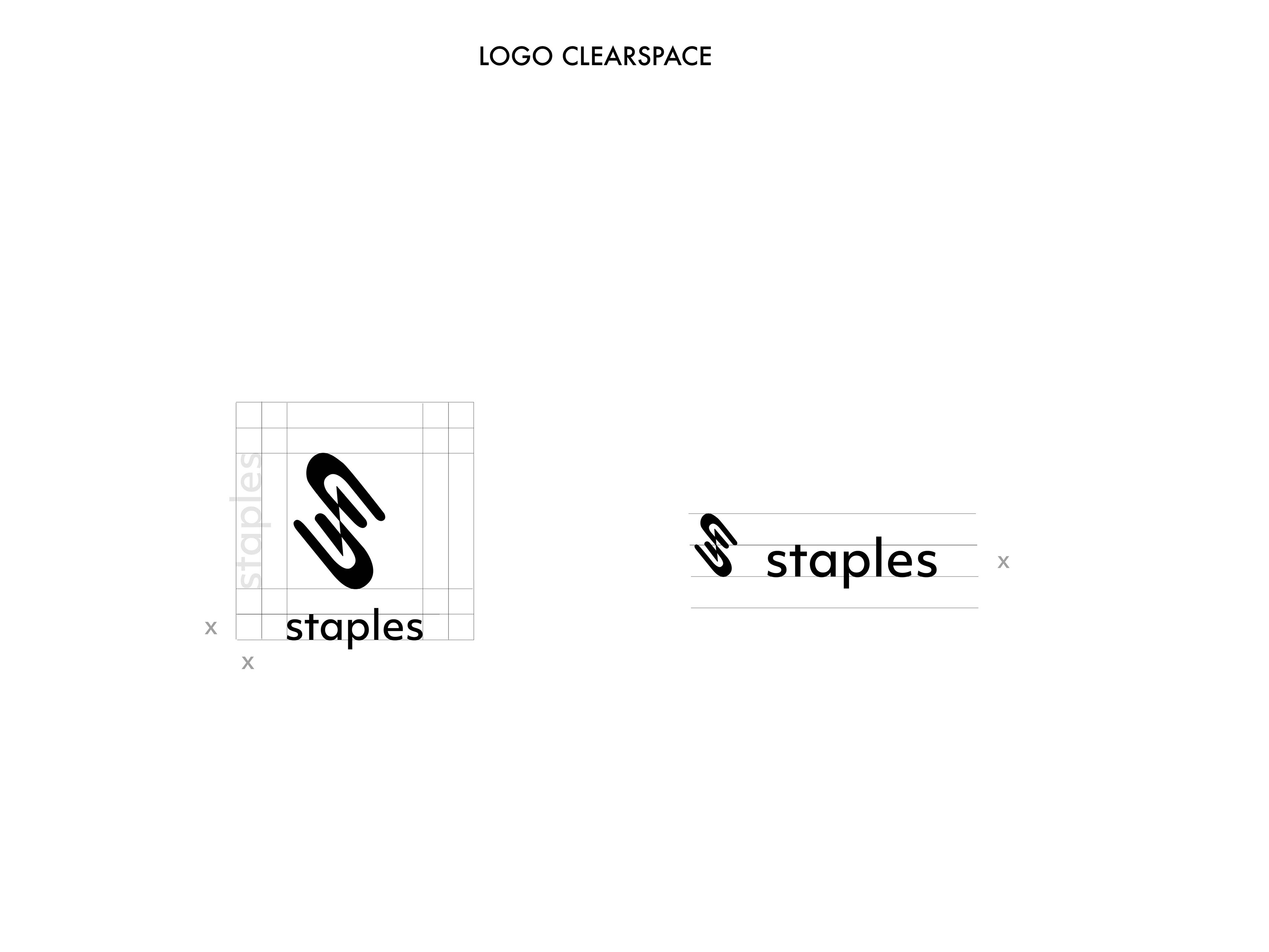
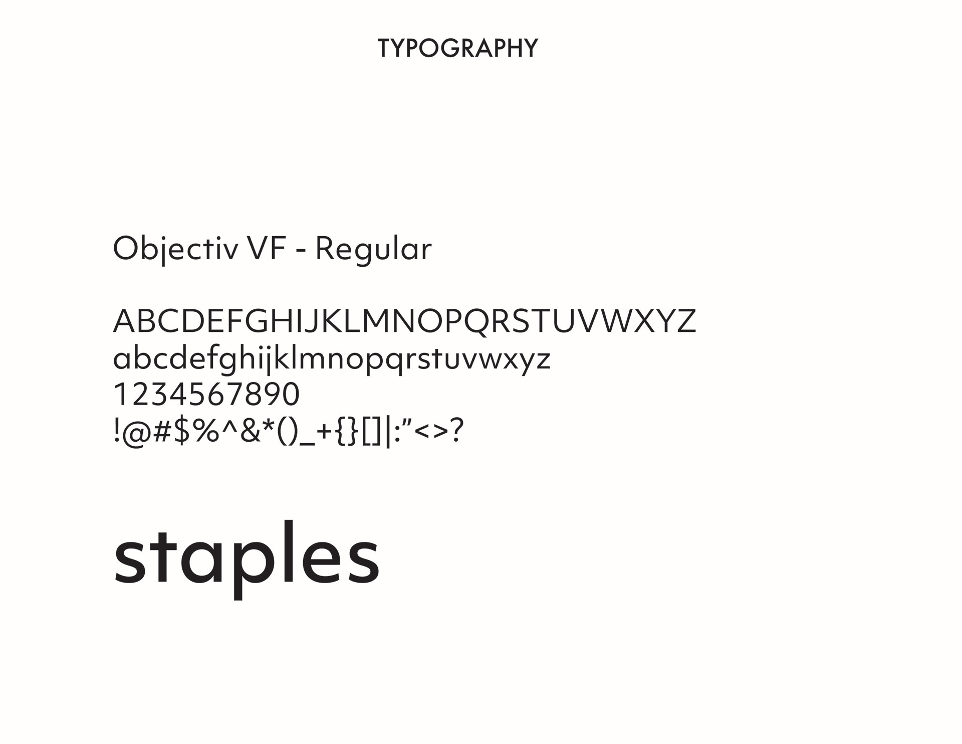
I started drawing the design using pen tool in Illustrator leaving and adding some parts to the paperclip template forming this zigzag looking design. I used the sanserif typeface Objectiv as it matches really well with the modern design. I used a darker shade of red #D01E2D which looks and feels better than the bright red.
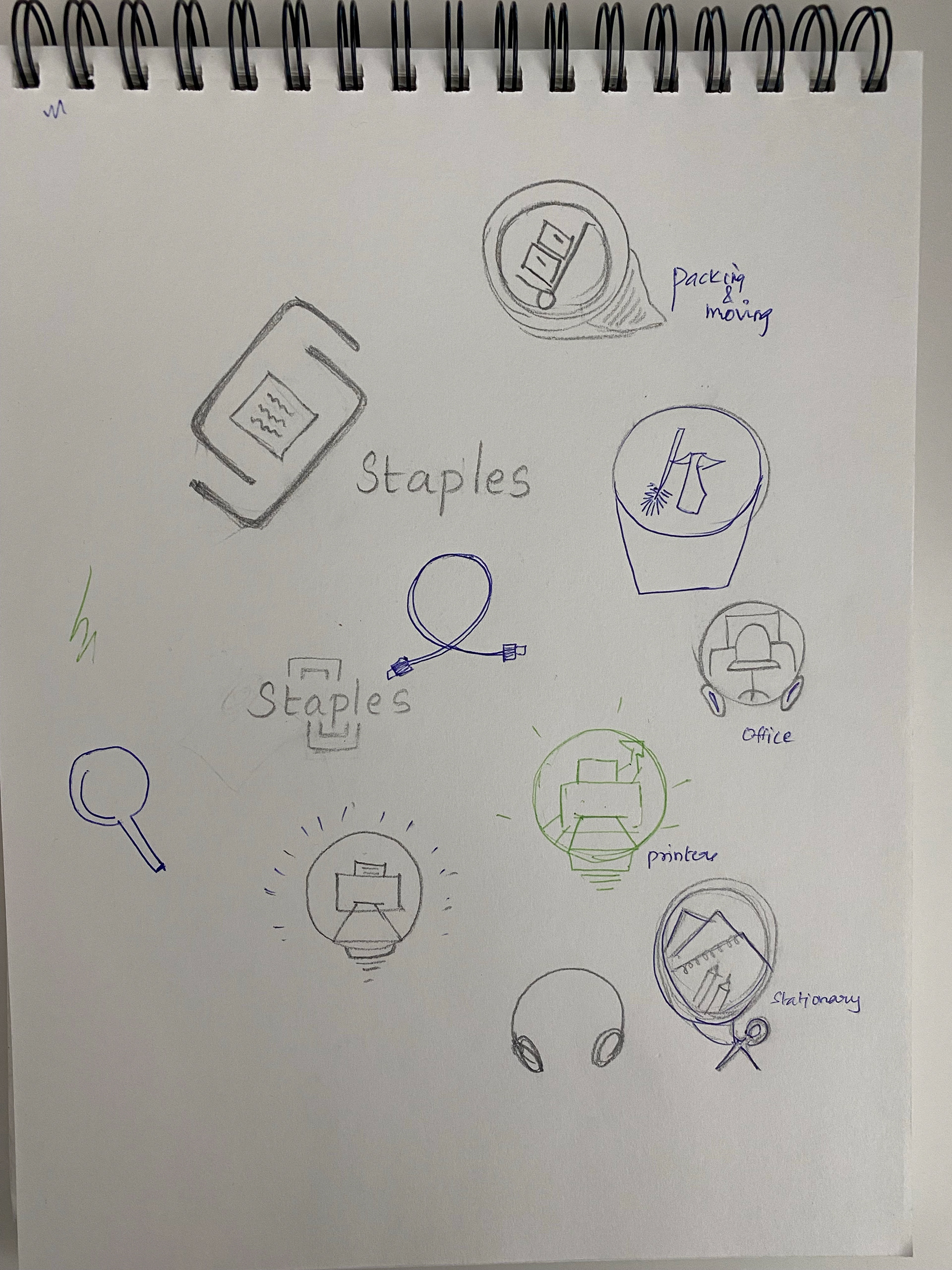
Logo sketches
style guide
brand stationery
Design Process
I wanted to deviate from the literal staple design as staples is a stationary store that can include other stationary items like paperclips, pens, pencils,etc. And I wanted the design to also represent the letter S, the starting letter of Staples. So I inverted a paperclip and stacked two next to each other to look like S.
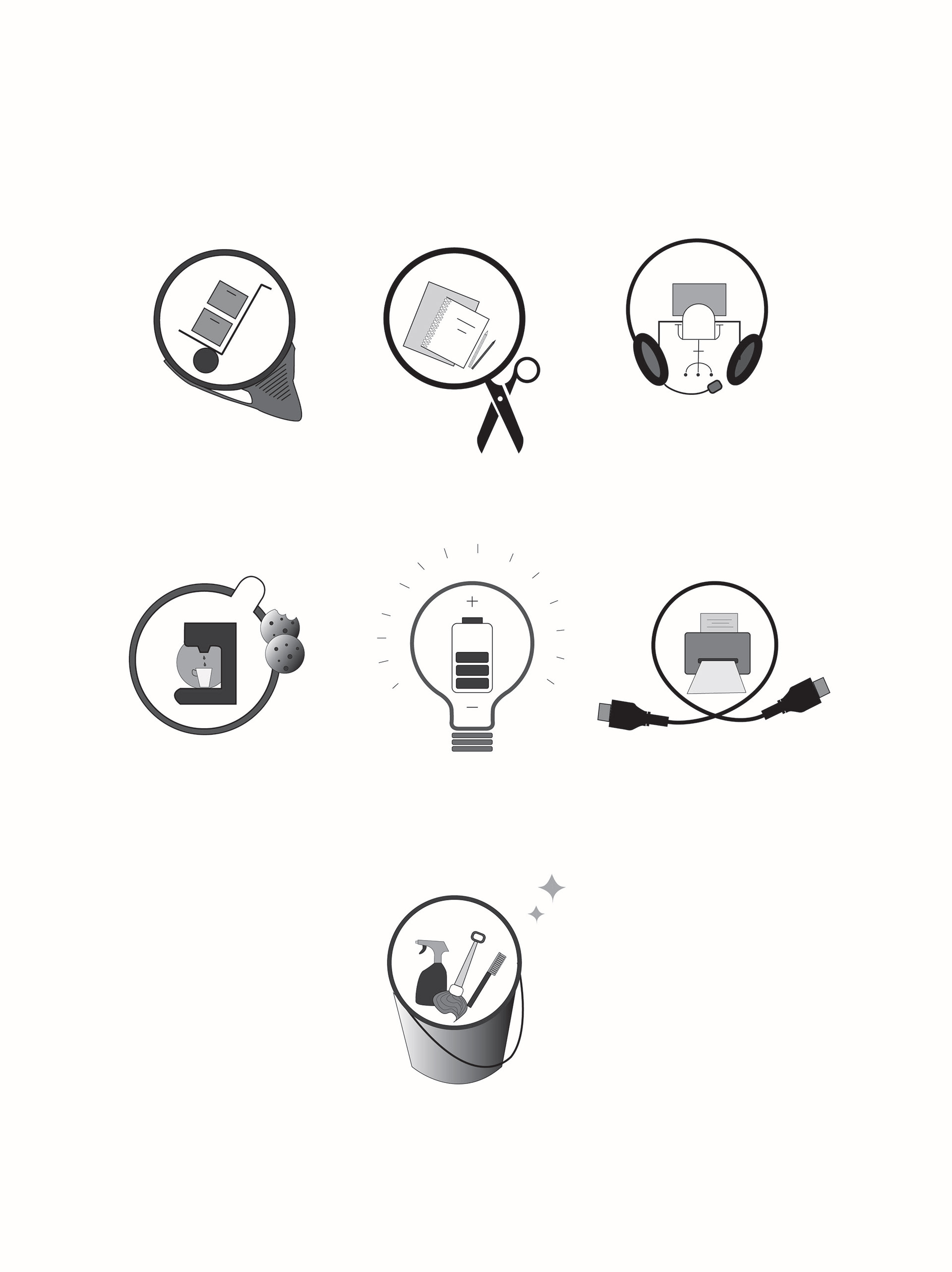
Icons set
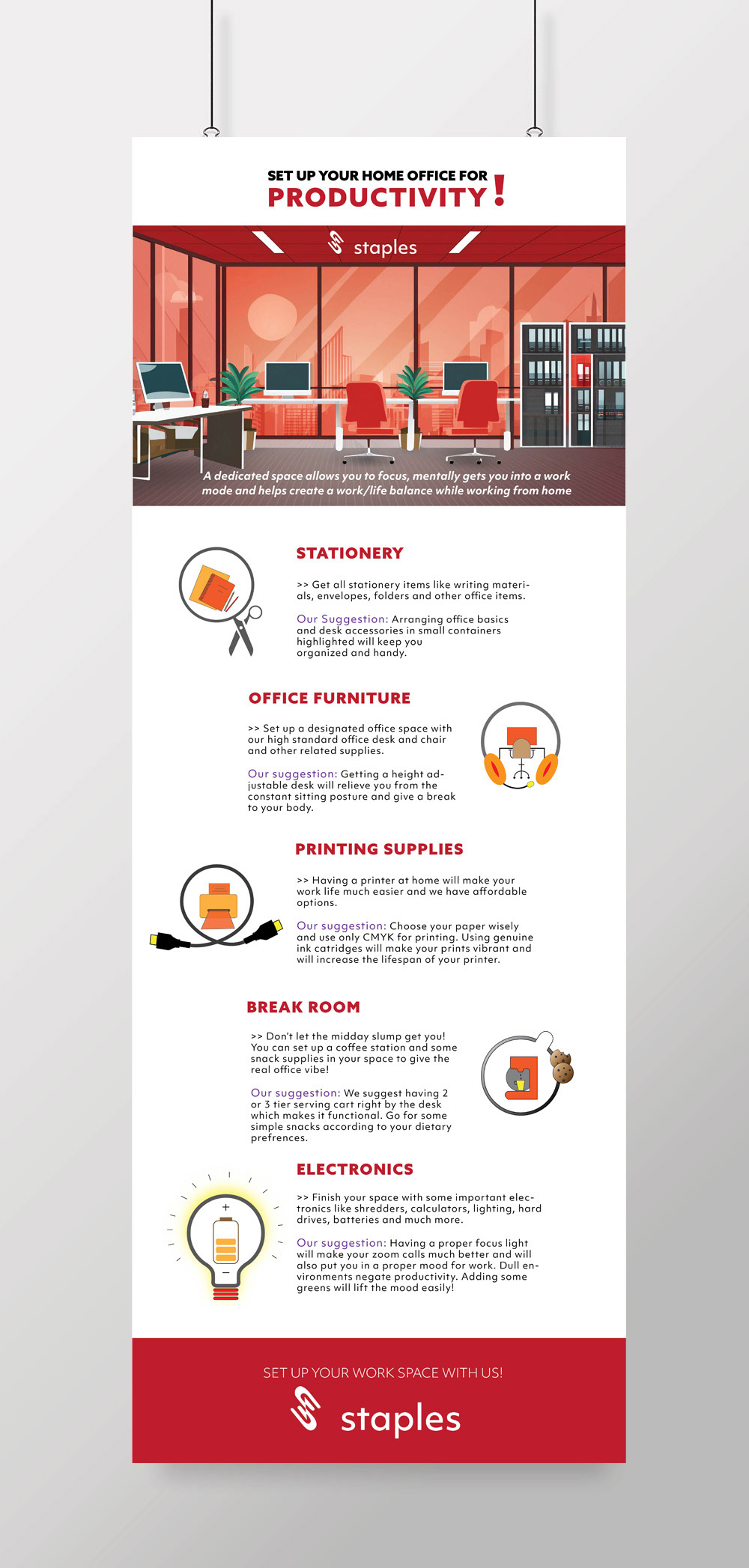
infographic
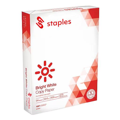
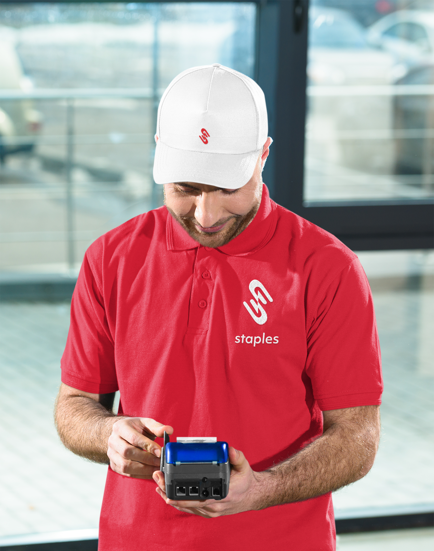
MERCH

Truck design
WEBSITE EXPERIENCE
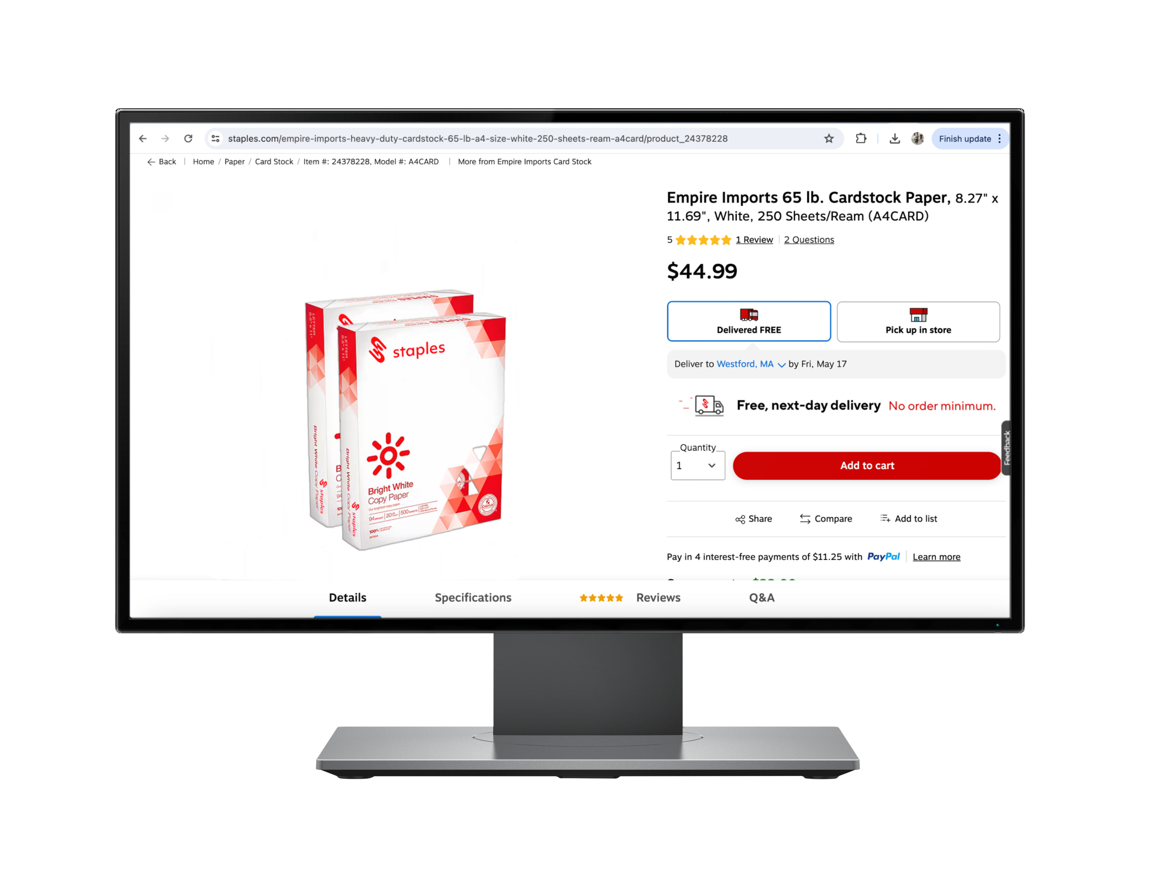
product page
